Magcloud Digest: a review
I wrote, in what seems like a previous life, about having become disillusioned with Instagram as a platform for sharing long-form work and how I'd started to look for alternatives.
In researching what was available, I came across Magcloud. At the time, I was looking for magazine format and for various reasons decided to go with Blurb. But the Magcloud Digest really appealed to me. I also came across Dan Milnor's video, where he talks about using the Digest as a portfolio/business card - that appealed even more.
In making the magazine, I took Dan's advice and made a proof copy. They were wise words, I made countless changes between the proof and the final version.
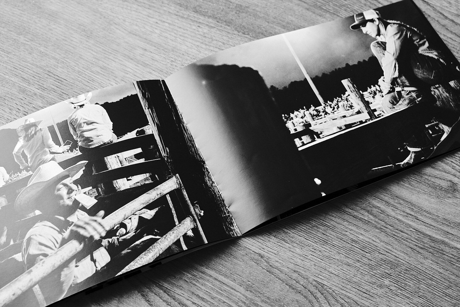
So, what is the Digest? It's an 8.25" x 5.25", soft-cover publication, which is available in portrait or landscape formats. I almost always shoot landscape (Hassy excluded), even for portraits which I know makes no sense. But I'm not going to change now, so the landscape format really works well for me. The Digest is available Saddle Stitch (that's stapled to you and me) from 8-100 pages, or Perfect Bound (think fashion magazine) from 24 to a whopping 384 pages.
My proof copy is 16 pages (including the cover) which cost $2.56, plus $4.00 shipping to the UK. Naturally, the more you order, the cheaper it becomes. So if I'd have ordered 20, instead of being $6.56 with delivery, they would have cost $2.82 each. Which makes it very affordable as a give away to potential clients.
The good and the not so good
Design tools: Magcloud doesn't have their own layout software like Blurb's excellent, Bookwright. They do, however, have a bunch of templates for different software from Indesign and Photoshop to Word and QuarkXPress. I use Affinity Publisher, there isn't a Publisher template as such, but I found I could open the Photoshop template in Publisher with no problems.
Paper: The paper is acid-free and FSC-certified. The weight depends on the number of pages in your publication. Up to 16 pages it's 100# (271gsm), then 80# from 20-60 pages, which one of the reasons I opted for 16 pages rather than 20. I was pleasantly surprised by the quality and feel of the paper. It has a satin finish, which I really like, of course, that's a matter of taste.
Print quality: Again, no complaints. My Digest contains both colour and monochrome images, the colour shots look vivid and colour accurate. The blacks are black. I'd be confident using it as my portfolio.
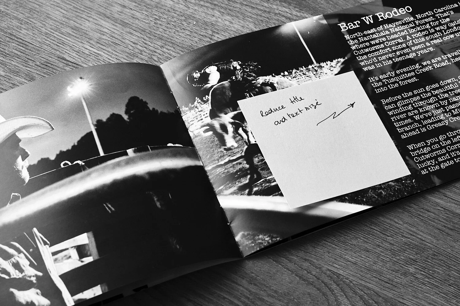
The layout: needs work, a lot of work, but that's fine it's a proof! Since this version was printed I've ditched some images and moved others around, I've changed the font and redesigned the cover. I'll be ordering a second proof this week, then we'll really get into the nitpicky details.
I nearly forgot to mention the QR code Magcloud add to every publication. Make sure you make space for it in your layout.
Why not make your own Digest! If you do, let me know what you think.
And as always, let's be careful out there.


